Data visualization
On this page
Additional colours for data visualisation and Office
Vzorník barev výhradně pro použití v grafech a infografikách, kde je potřeba barevně odlišit jednotlivé prvky
| Blue |
|---|
| #1e7086 |
| value |
| Green |
|---|
| #67c18c |
| value |
| Red |
|---|
| #f05b72 |
| value |
| Yellow |
|---|
| #ffcc4e |
| value |
| Cyan |
|---|
| #56c5d0 |
| value |
| Violet |
|---|
| #9f95ac |
| value |
| Gray |
|---|
| #9cb4be |
| value |
Templates for MS OFFICE
Download colour schemes, excel templates and stylistic kits for Office.
MS OFFICE theme colors & fonts
ms_office_font_and_color_theme.zip | 1.57 KB
Graphs
Present data in a consistent visual brand style.
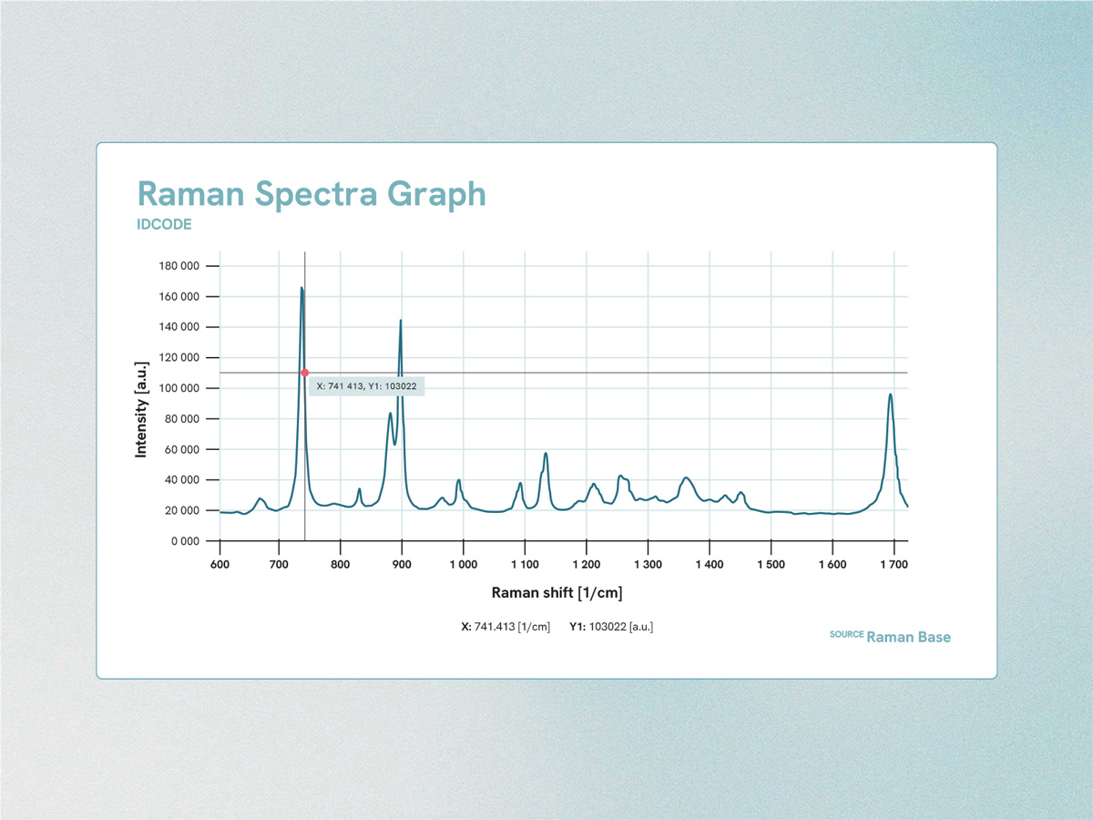
Sample spectrum display showing the selected measurement point.
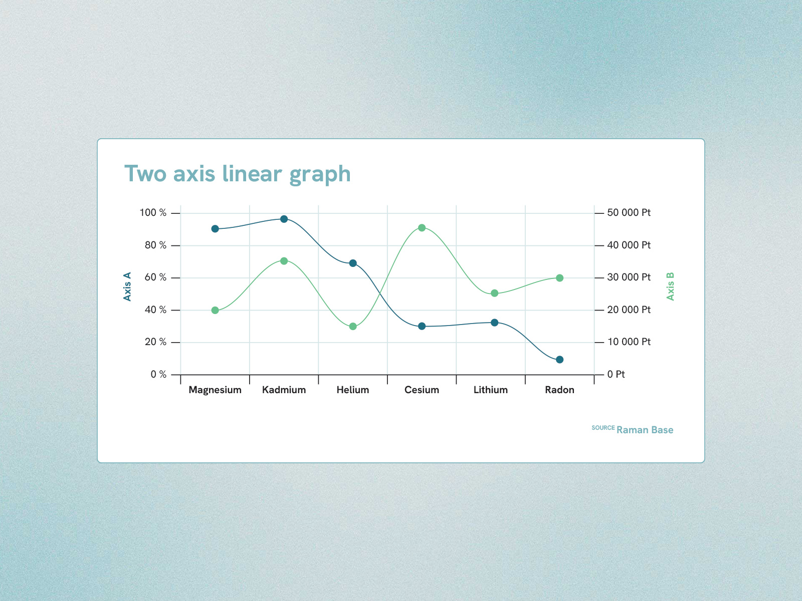
When comparing or displaying multiple values, use sufficiently contrasting color values. The line has a higher strength than the chart components and the more important axis or value is also the darker one.
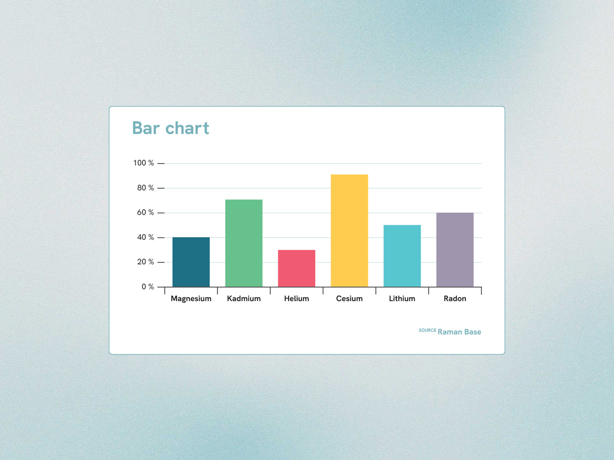
Thicker bold data columns are preferred over narrower ones, ideally around 80% of the width of the overall column.
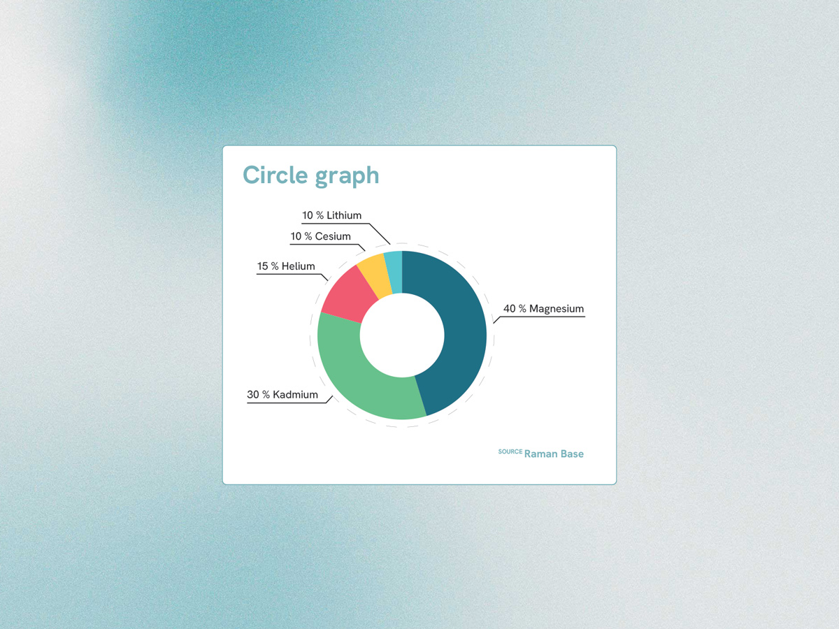
Pie chart with ring and flag labels.
Table
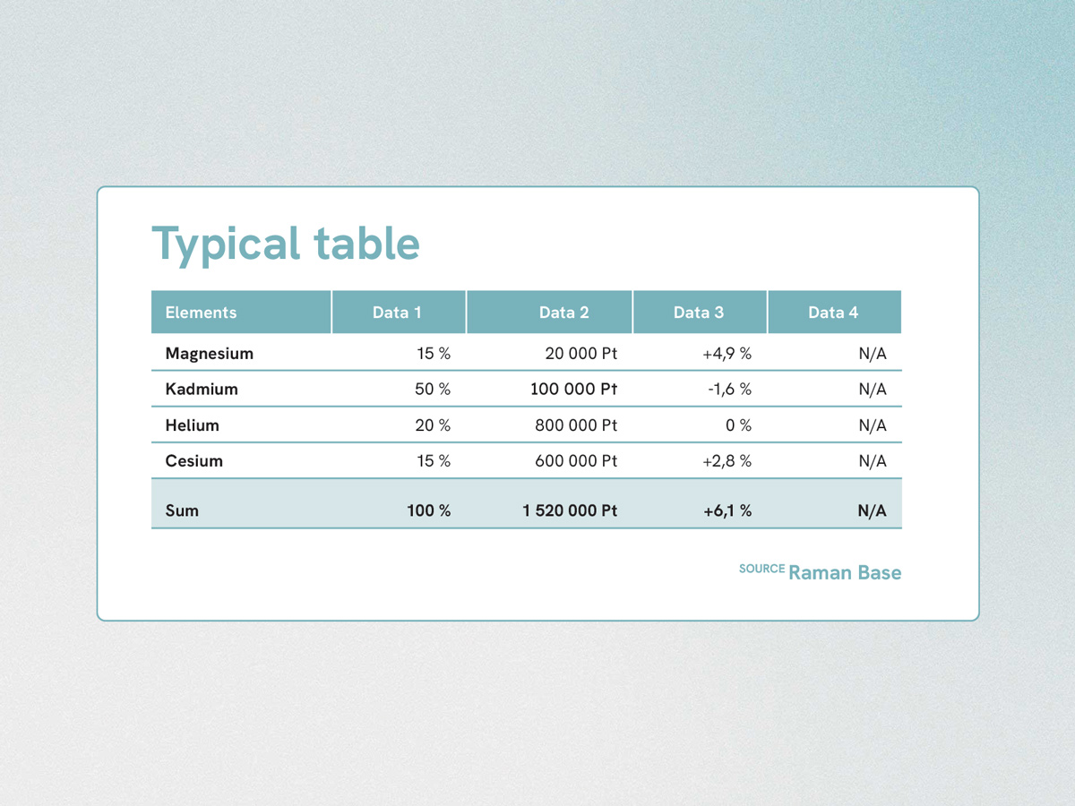
Tables are created simply using only different line heights and full underlining to highlight the data, the lines are always ending square.